
Logo design and branding projects
CASH FLOW MASTERED - Challenge/Needs
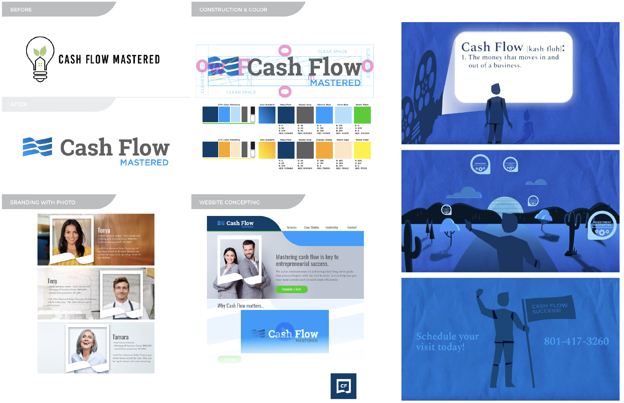
Cash Flow Mastered contacted me with a series of challenges: their branding was unclear, their website design was stale, and their company messaging wasn’t anchored in a product offering and lacked clarity. Their desire was to connect with successful entrepreneurs who had ambitious goals with their finances. They wanted to connect with these different personalities and convey their solutions without giving away their secret sauce. No logo or existing piece of branding was sacred and they were willing to deep dive into best practices of communicating with their audience most effectively.
Strategy/Solutions
We started with an extensive audit of their company message and how it would best be organized on their website. We researched what was most effective on other websites selling financial services and strategies. We strategically picked colors and color systems that could stretch over present and future services. The previous logo didn’t have valuable brand equity so we started with a new one from scratch. A new typeface was selected and paired with an icon that would have influence over many other design aspects of the brand. Custom photography wasn’t an option right out of the gate so we made deliberate decisions around the style of stock photography that would be used and how that would represent actual client scenarios. A family of custom icons to be used across the site was created as well as a styled frame that would help spotlight different client personalities. A video was created for their new home page that would help clarify frequently used terms and provide a high-level overview of core services.
OSMIUM STRENGTH - Challenge/Needs
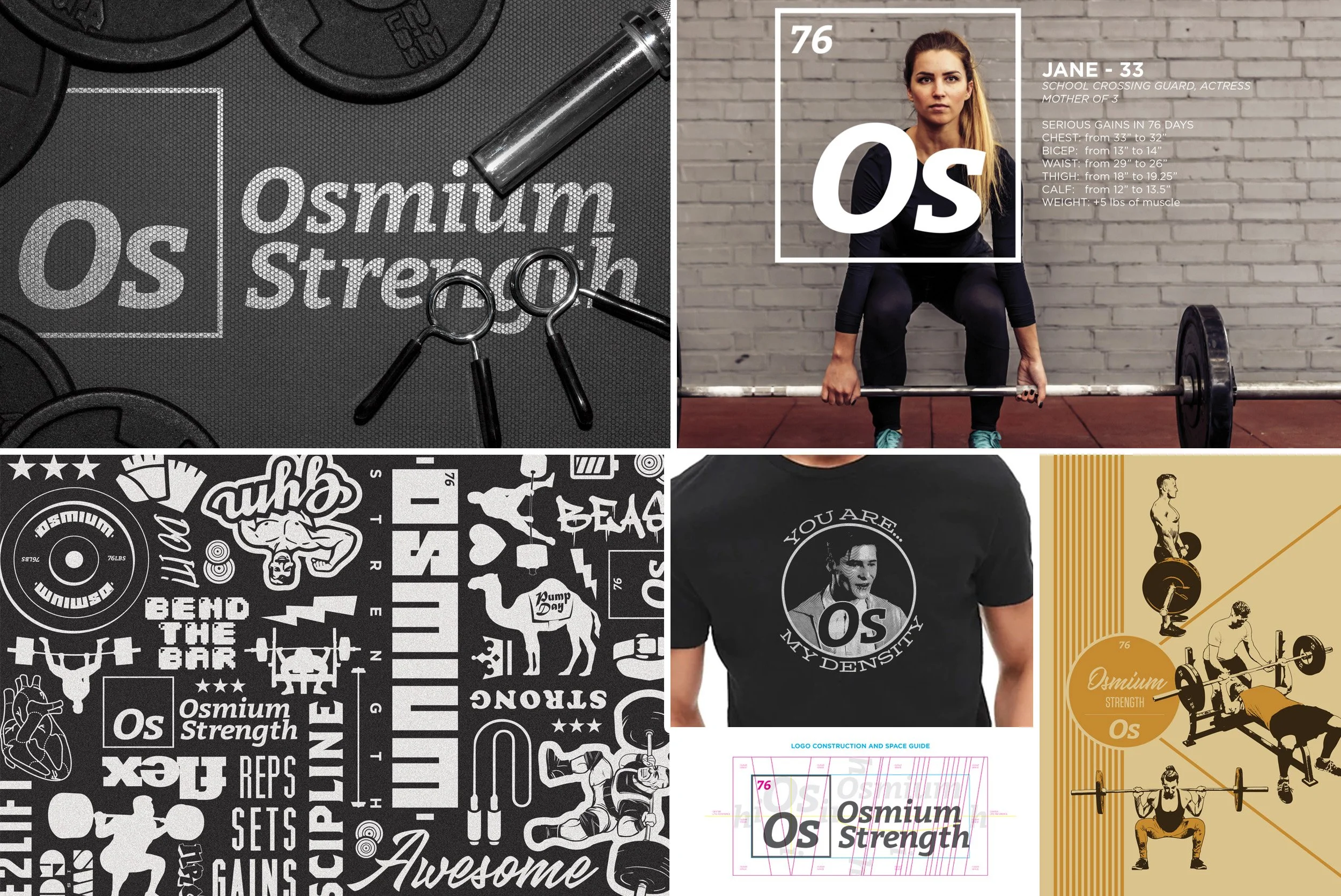
Osmium Strength needed a way to market their business with pride. They asked me to help them polish the look of Their logo which deliberately hinted at the design of the periodic table. Osmium just so happens to be the most dense element on that chart. Achieving muscle density was a key element to their training program. With this as our starting point, I aimed to strengthen the look of what they already had going for them and created a number of different ways to further tell their company story.
Strategy/Solutions
The logo got a newer and bolder typeface which was tweaked here and there to nest together in a most visually pleasing way. A second logo was created with a beefier look to appeal to a client base solely interested in bulking their physique. The branding toolkit built was a lot of fun to put together. It explored gym and weightlifting culture, client profiles and personalities and pop culture. What Osmium got was so much more than a logo. The brand kit they now had allowed them to connect with their audience in a memorable and shareable way.
FARMINGTON TRAILS - Challenge/Needs
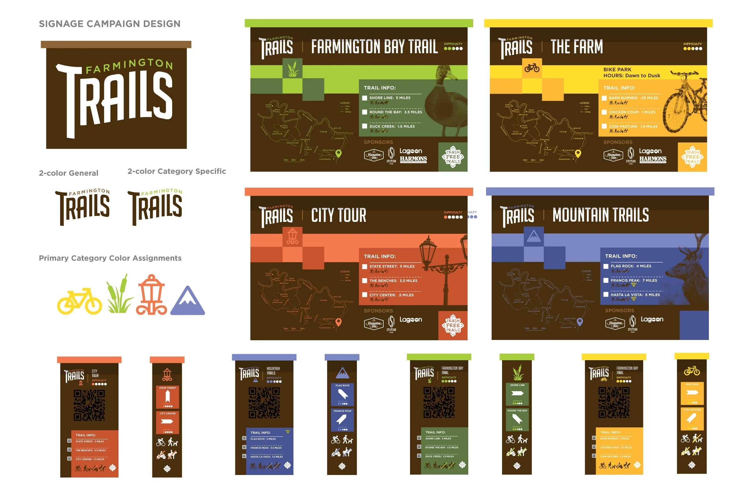
Farmington City wanted a way to make their city bike trails more recognizable, more user friendly and increase their use with the nearby bike enthusiasts. They have a diverse offering of trails. This challenge proved to be a great opportunity to call out the different riding options through iconography and color.
Strategy/Solutions
The project started with a logo, icon and color system that would anchor the sign campaign across the different trail sites. The uniformity of the campaign would lend to optimal understanding of trail features, expectations and standards. It was important to be able to see the sign campaign cascade across various different sign sizes and location markers as well as craft something that would be practical and durable in the outdoor elements.
HERE THERE - Challenge/Needs
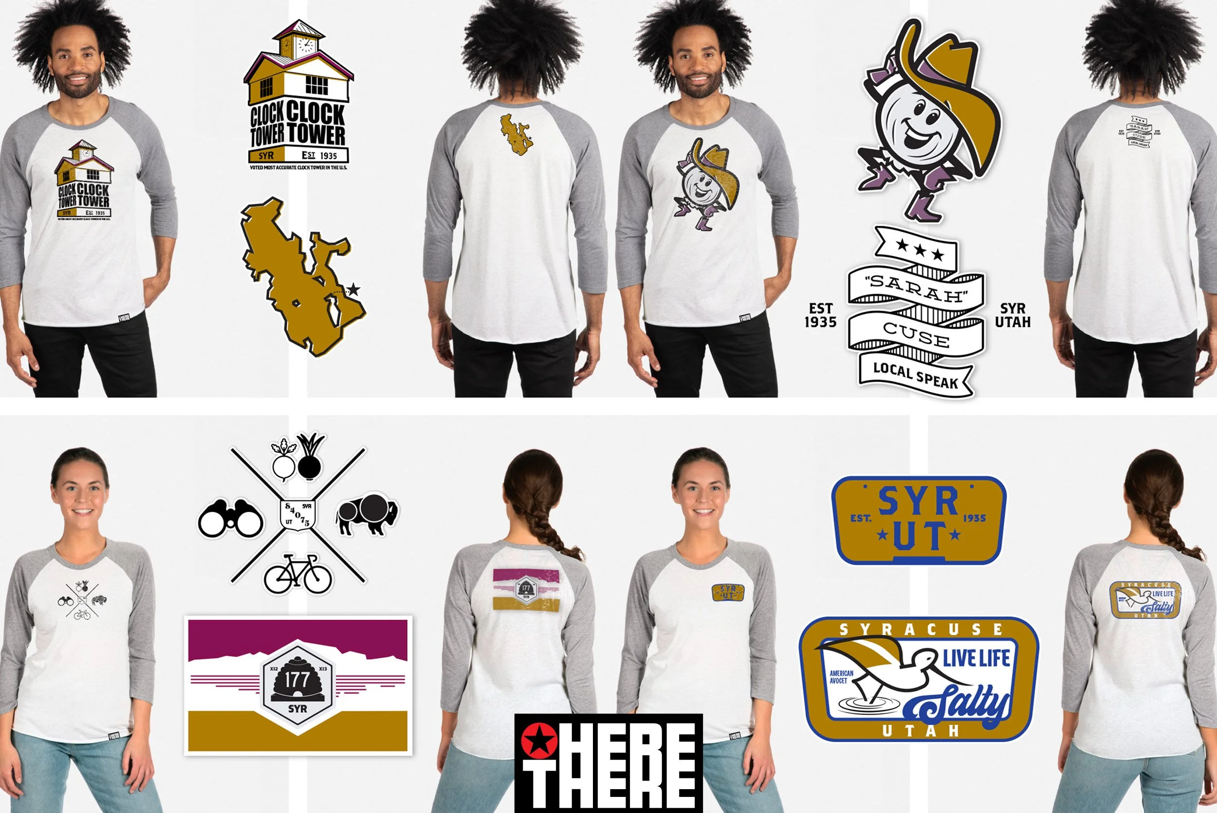
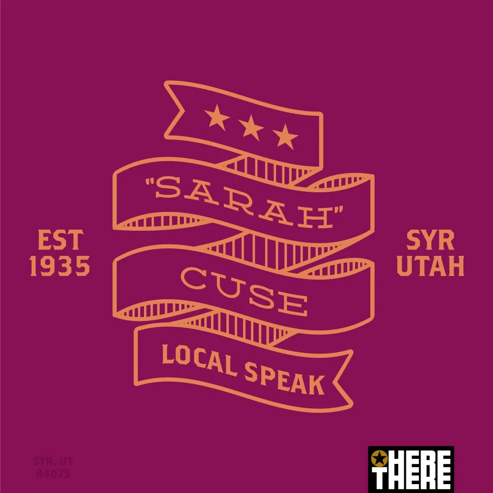
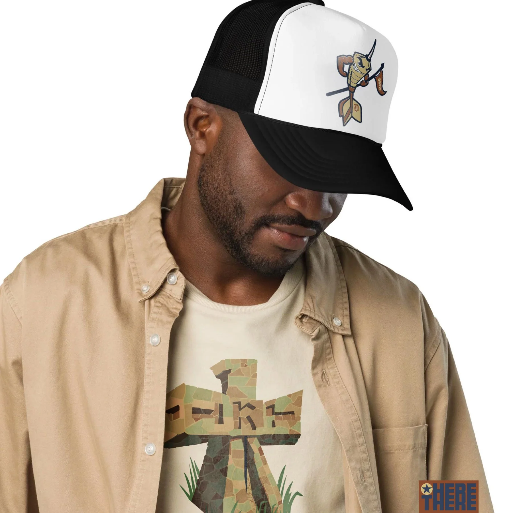
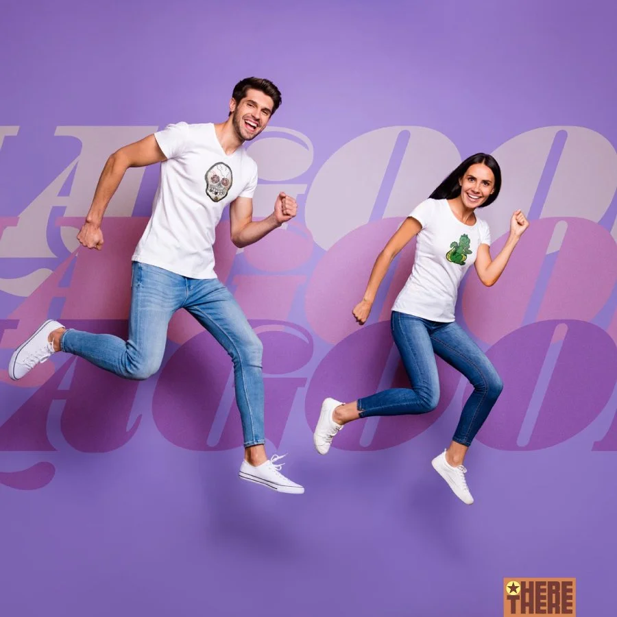
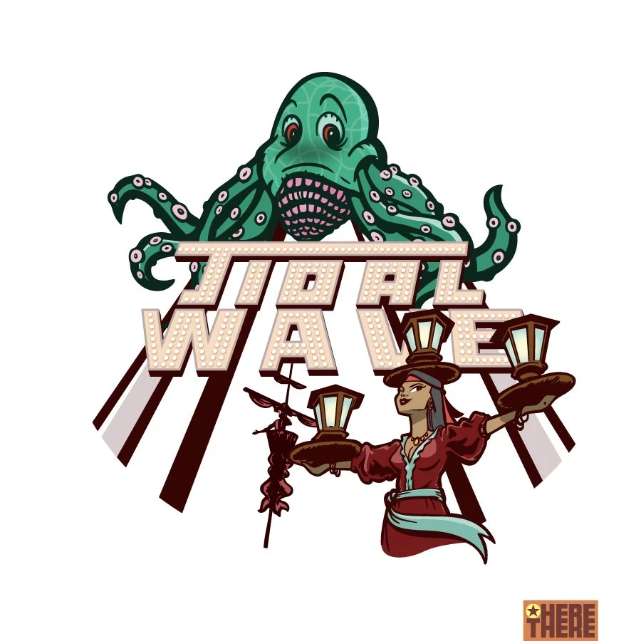
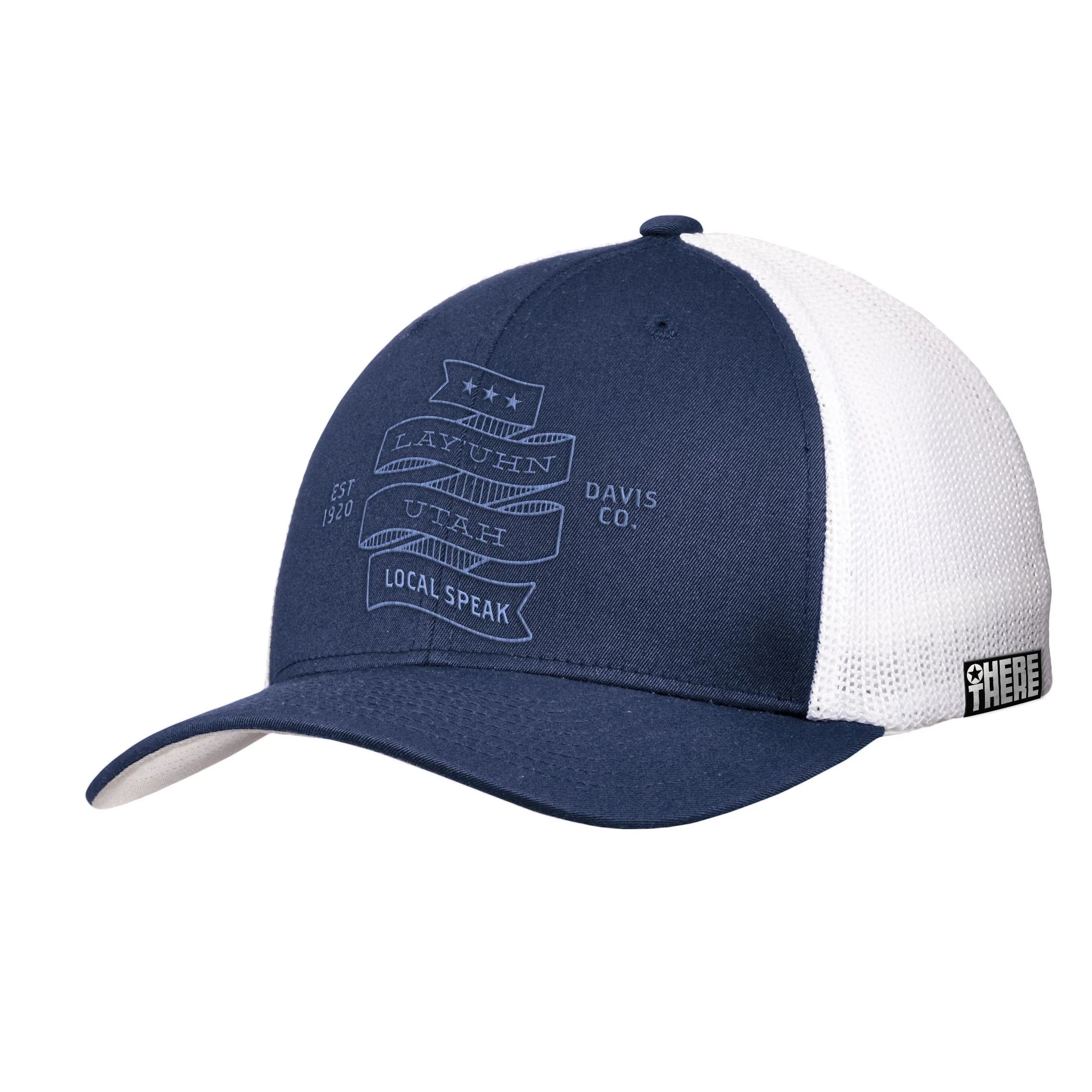
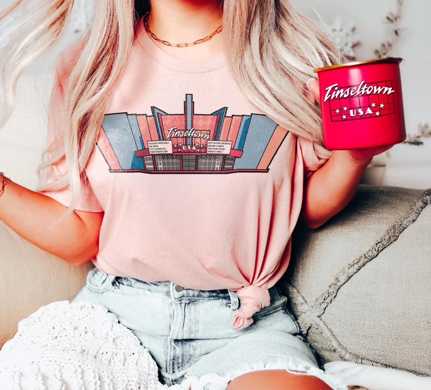
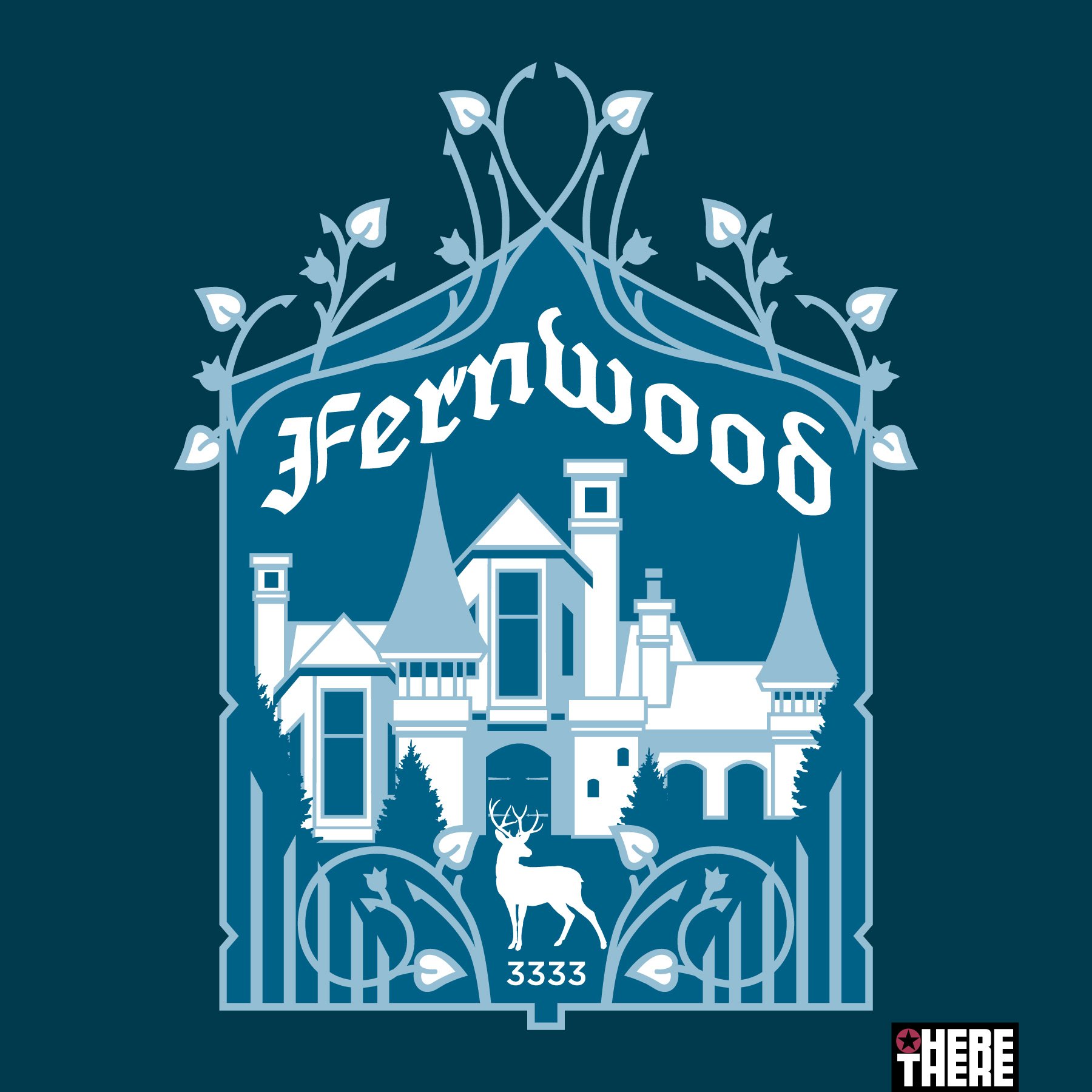
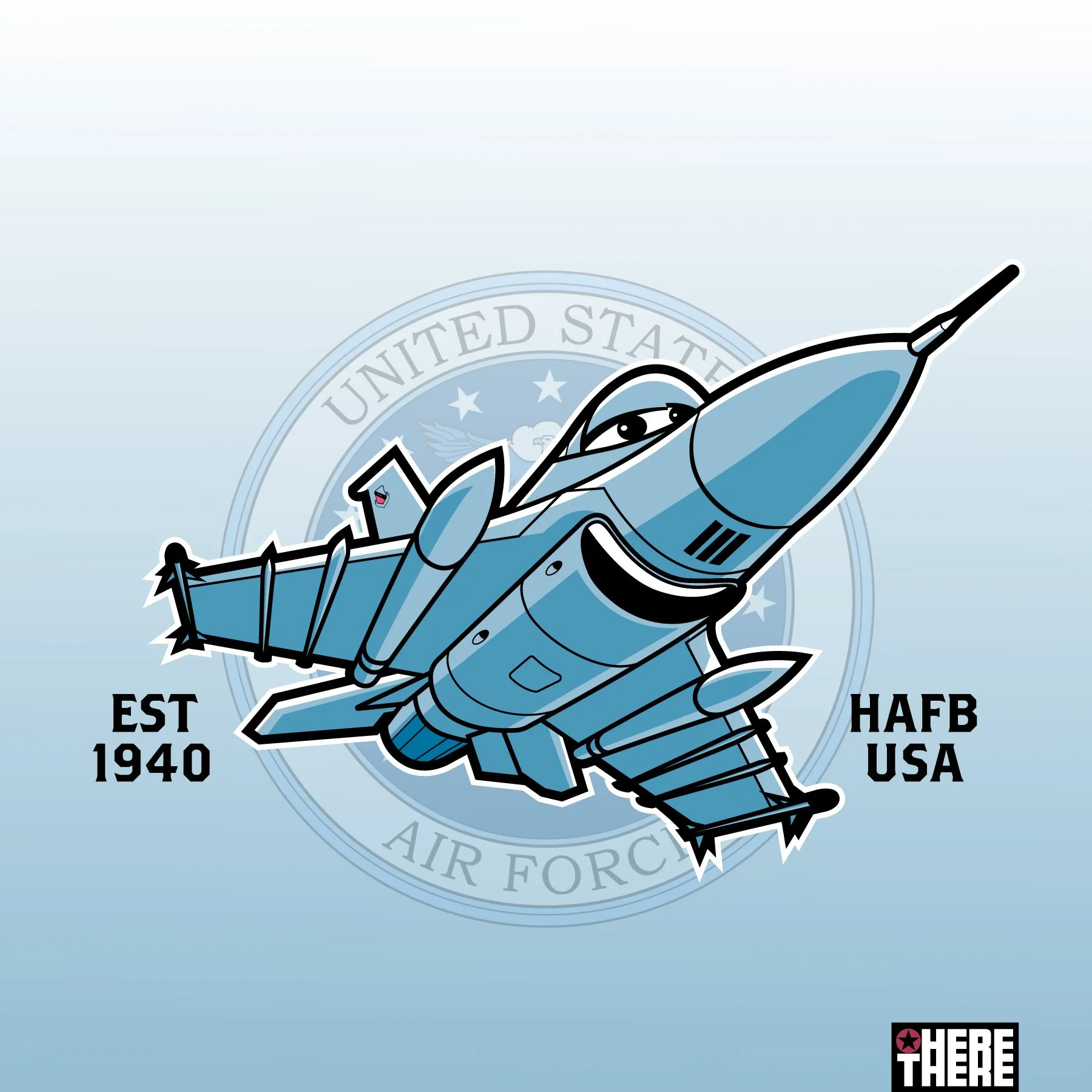
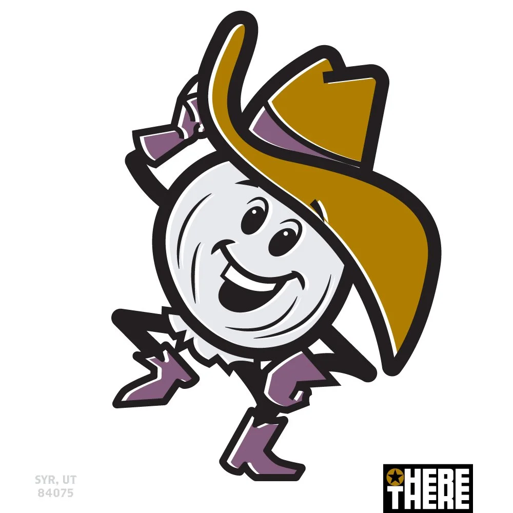
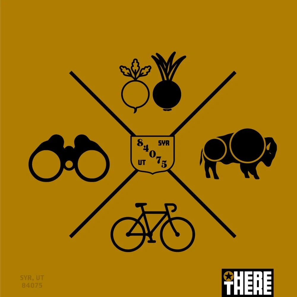
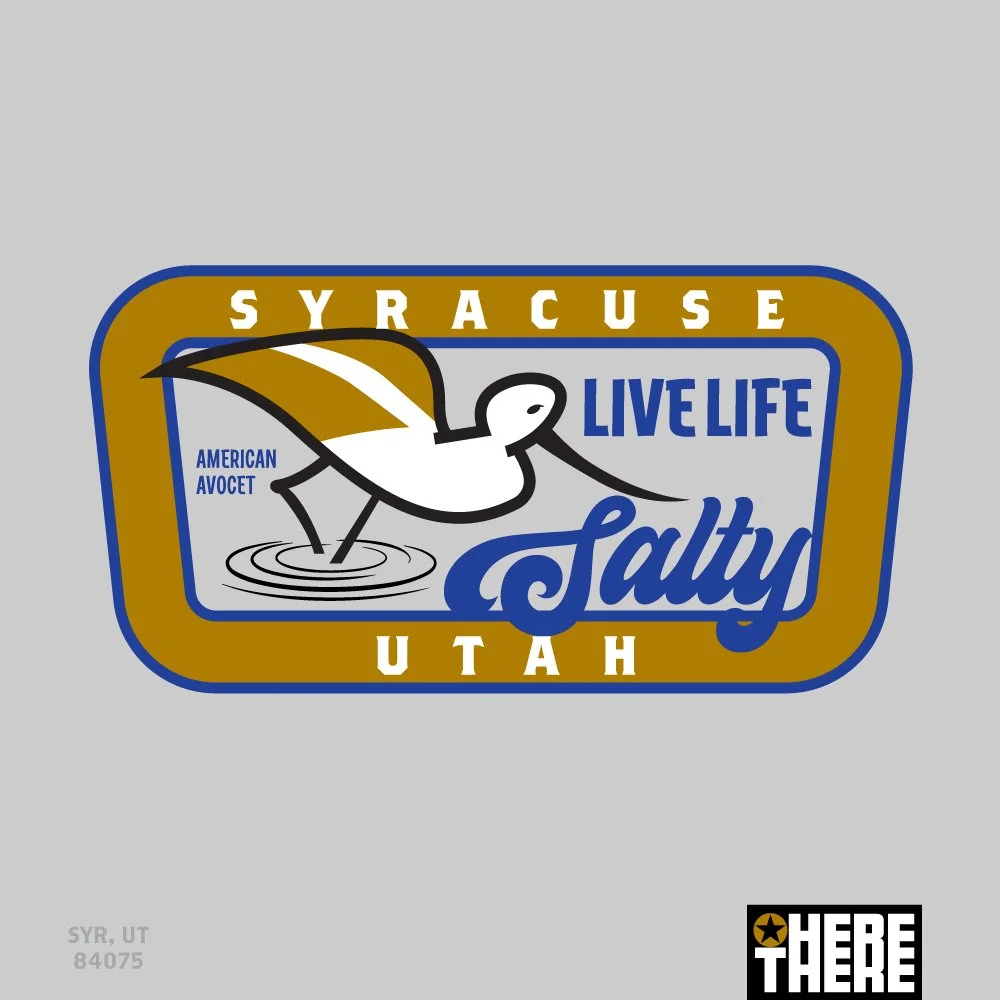
While perusing through a gift shop in Oceanside, California, I wondered what a gift shop should look like in the small suburban towns that I’ve grown up in and where I’ve raised my family. I realized that the cities I was most interested in representing with swag were the cities I loved the most—the places I had the strongest relationship with. It is fun to visit the popular tourist cities like New York or Los Angeles, but I don’t have any real allegiance to those places. I continued thinking about what makes these suburban towns unique for content that might make a fun t-shirt or hat. This is how HereThere was born.
Strategy/Solutions
HereThere is short for ‘Live Here, Been There’. The designs in this collection all recognize the little cities where we actually live and where we actually create their histories. The creative content for di erent designs would come from a city’s history, accent, architecture, signage, reputation, legends and more. These are the perfect additions to one’s clothing and accessories to rep the city they are most proud of contributing to as a citizen or neighbor.
JOSHUWASH - Challenge/Needs
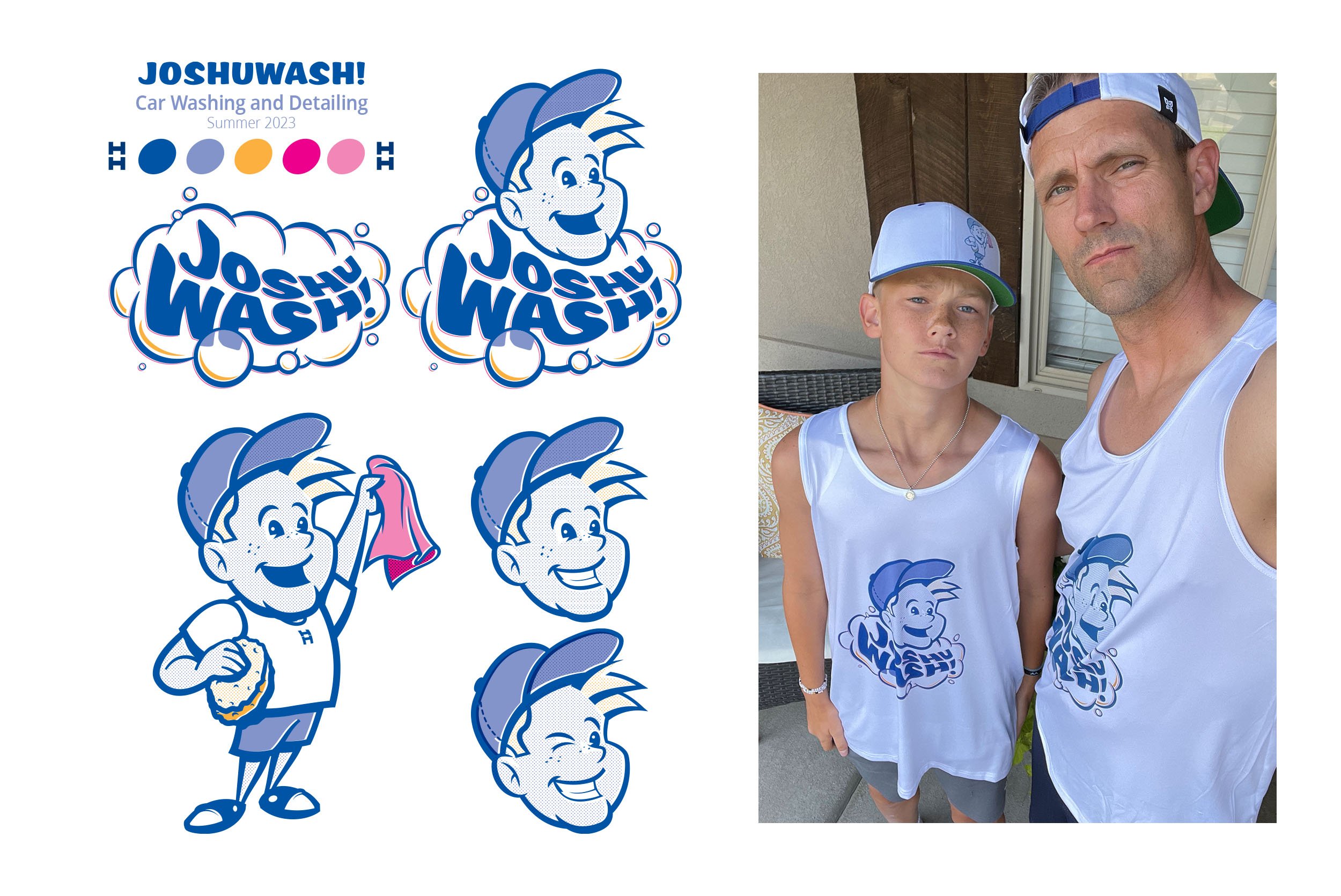
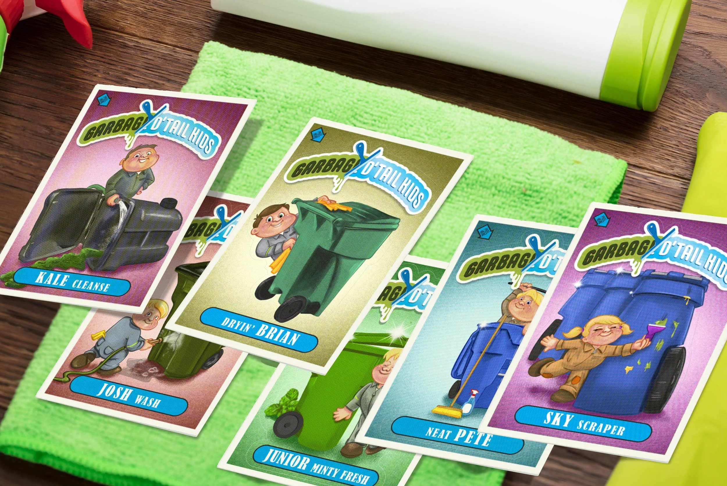
It’s natural for kids to want to have money over the summer months so they can have a little spending money of their own. My kids’ entrepreneurial cousins started earning money of their own washing garbage cans. This inspired my boys to want to do the same. I knew they would be successful, but I knew they’d be really successful if they marketed themselves more. Such was the inspiration for both Joshuwash and Garbage D’Tail kids
Creative Approach
I told my 13-year-old that I could help him have a summer job if he really wanted. I’d create a fun little brand for him to use as he detailed cars in the area. His name is Joshua so applying some portmanteau skills we came up with Joshuwash. Got some shirts and hats made to really sell the brand. How could anyone say no to this kid? Another summer venture was cleaning out dirty garbage cans. Lots of neighbors actually really appreciate this service and will pay good money for it. They especially love the trade-able cards representing their clean garbage can service and the less-than-clean cards from the 80s that inspired their design.